building the
home Interface
An experience platform to preform complex Orchestration through simple interaction
Savant, a luxury home automation company with over a decade in the business wanted to grow their exclusive experience into the mid market. The Savant Pro customer relied on a dispersed UI throughout the home, utilizing physical keypads and dedicated mobile devices on the wall. We first identified five key moments throughout the daily cycles of our archetypes; Waking Up, Leaving, Coming Home, Going to Bed and Entertaining. While comparing the Savant Pro and mid market archetypes, there wasn’t a fundamental difference in need, just scalability. As IOT devices became cheaper, the adoption of connected lighting, climate and shades would become more prevalent. We needed one platform that could scale.
the home context
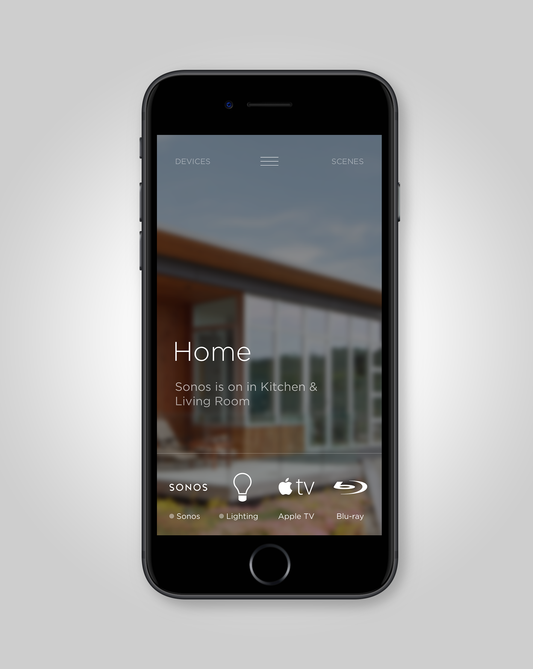
We began to develop a navigation paradigm which considered a wide variety of home configurations—including a small system in just a few rooms to a whole-home integration with a Savant Pro system. The result was a gesture-based navigation, that provided an elegant and graceful way to move throughout the Savant App. Swiping down anywhere on the “Home” or “Room” view would reveal the high level "Rooms" navigation, while a simple tap would advance users to that new location content. Individual services were filtered by location, which would mitigate additional navigation between a room structure or a service structure. The background treatment of each room could be customized to match the aesthetic of the environment, allowing the UI to feel seamlessly integrated when on display.
the neolithic Age Of automation
The term "Smart devices" is grossly overused and misrepresented. These devices are merely connected, mostly lacking the ability to make decisions for the user. Today the technology to make true complex determinations of the state of the user is not reliable. So how can you toe into automation inferring states with an incomplete context? We didn't want to take the risk of creating a rouge home, making half baked decisions on behalf on the homeowner. Instead we created an activity feed that would give a clear view into the state of the home and a history of actions the system had taken on behalf of the user. When a Scene was activated, the activity feed would show what changes were made and by whom. If a scheduled Scene had activated, or a new device was discovered within the home, the event could be confirmed within the App. This would open a dialog with the home and the homeowner, as newer technologies allowed for further layers of automation, this communication platform would become the cornerstone of the app experience.
complex ORCHESTRATION
though simple interaction
The core value of a Savant Home home was the ability to have one simple action preform multiple complex tasks, aptly named Savant Scenes. In essence an easy button, programmable by the user to have coordinated control of habitual activities. This feature previously relied on the support of a professional integrator, who would manually create these Scenes on behalf of the homeowner. With the release of the Savant App and a shift into the mass consumer market, the user needed the ability to create these on their own. We built a persistent Scene panel across the UI, simply swiping from right to left would reveal the Scene panel. To simplify the creation of a Scene, the user could simply "capture" the current settings within a room or the whole home. To extend this functionality further, we took advantage of the native iOS and Android widgets. Users could access their Savant Scenes without the need to unlock their phone or open the app, greatly reducing the time to control.
time to control
Efficiency of interactions to the control UI was paramount, but slathering the UI with buttons would be overwhelming. What we needed was a layer of controls, revealed only to the user during specific tasks without the need to navigate outside of the current UI. This need morphed into what we called "Micro Interactions." Wherever a service icon was displayed within the app, the user could long press (before Apple's Force Touch, but would function identically) to display an overlay menu with popular commands for that specific service. Actions such as dimming the lights, advancing a song, or closing the shades, could be controlled without the need to launch into the service.
Lead UX/UI by Ryan Kitson & Jaireh Tecarro, design by Chris Taylor & Julianne Sombat, Under VP of Creative Bryant Brennan


